NAME
The name we’ve chosen for Nova Globe refers to the area of activity (the whole world) and innovation, which is the guiding idea for the founders. This name is unique in the national dimension (Great Britain). Its meaning field is large enough that the brand name will remain valid despite the planned expansion of the company’s range in the future.
LOGO
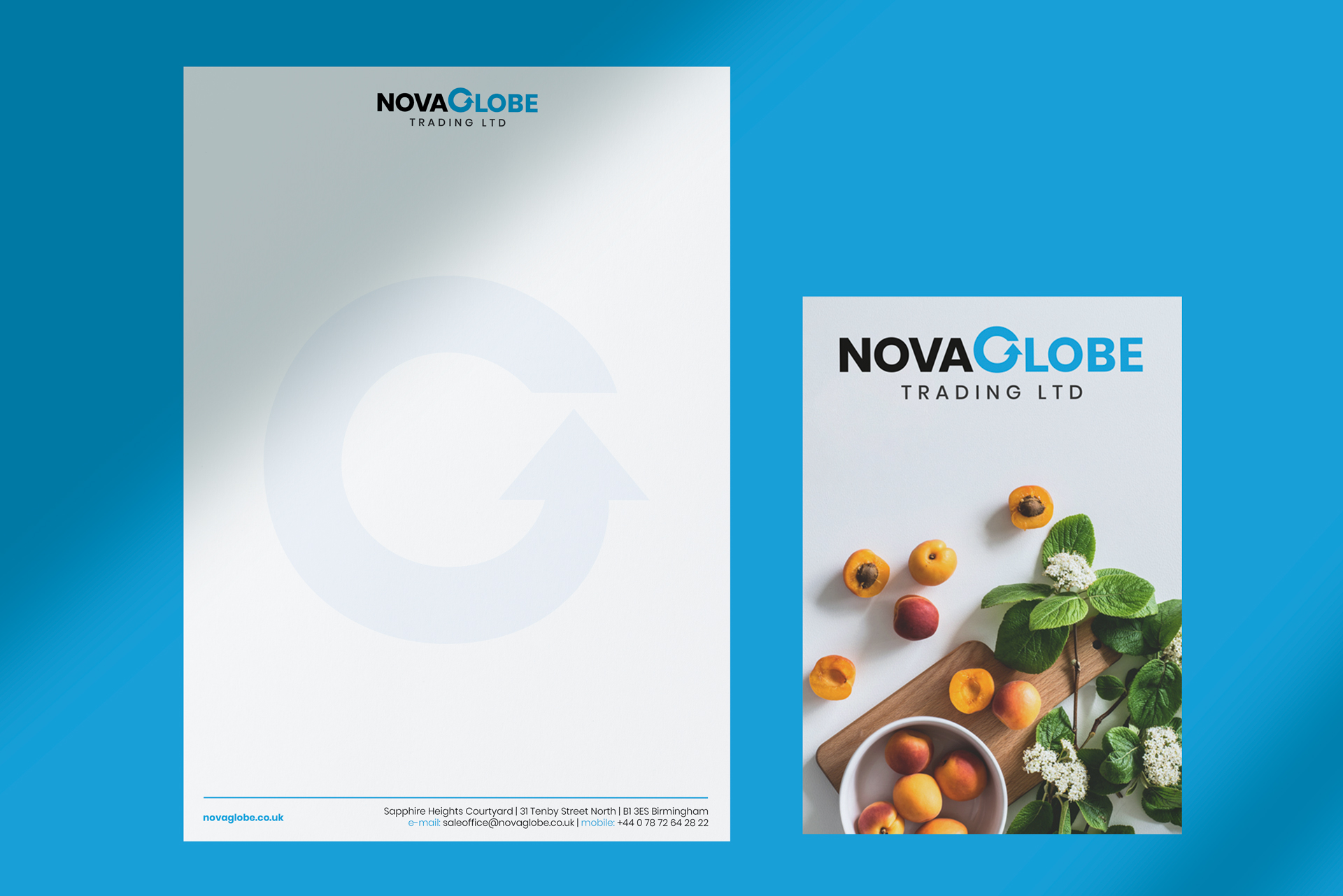
For the design of the Nova Globe Trading Ltd. logo, the graphic form, colors and design consistent with the adopted assumptions regarding the brand strategy were chosen. The company deals in international trade. The letter G was placed in the middle of the logotype thanks to the appropriate font selection, individual correction of the shape and the lights between every letter. The letter G acts as a sygnet which form refers to the symbol of trade and the shape of the globe. The graphic sign designed for NovaGlobe was to fulfill specific practical functions – to evoke specific associations and

Corporate Identity
Company stationary designed by us use company colors and the unique shape of the sygnet, which as a watermark makes the appearance of white document spaces more attractive. The company stationery designs used the principle of minimalism, which in this case was an important test for the attractiveness of the graphic symbol and the selected company color.